

CMYK vs Pantone: How to Choose for Brand Colours in Print
CMYK builds colours from four inks; Pantone prints one mixed spot ink. When to use each, how paper changes colour and how to specify brand colours to suppliers.
5 min read
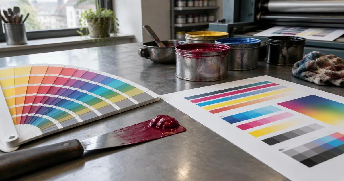
CMYK vs Pantone is the choice between building a colour from four process inks (cyan, magenta, yellow and black) and printing it with one pre-mixed spot ink. CMYK is cheaper and can reproduce photographs, but some brand colours fall outside its range. Pantone spot colours give a more exact and repeatable match for logos and brand colours, at the cost of an extra ink and usually an offset or flexo press.
What is CMYK?
CMYK printing places tiny dots of four inks next to and on top of each other, and the eye blends them into colours. Almost every full-colour brochure, catalogue and carton uses it. How the result looks is defined by a printing condition: in European sheet-fed offset, a common reference is FOGRA51, the data set behind the PSO Coated v3 profile for premium coated paper (Fogra, Characterisation data). According to the ICC profile registry, PSO Coated v3 is based on ISO 12647-2:2013 and uses a total area coverage of 300%.
Why CMYK colour depends on paper
Fogra publishes different data sets for different papers, for example FOGRA51 for coated and FOGRA52 for uncoated paper with optical brighteners. The same CMYK values will therefore print differently on gloss and uncoated stock. When your designer prepares files, they should use the profile your printer specifies.
What is a Pantone colour?
Pantone is a colour matching system in which each spot colour has a number and an ink formula. The printer mixes the ink to that formula and prints it as a separate colour. Pantone's Formula Guide Set shows 2,614 spot colours on both coated and uncoated paper, including 224 new colours added in the 2026 edition, as listed on Pantone's new colours page.
Coated and uncoated Pantone references
The same Pantone number looks different on coated (C) and uncoated (U) paper, because uncoated paper absorbs more ink. Always specify both the number and the paper type, for example 186 C, and check the colour in a printed guide rather than on screen.
CMYK vs Pantone: the main differences
| Factor | CMYK (process) | Pantone (spot) |
|---|---|---|
| Inks | Four standard inks | One mixed ink per colour |
| Photographs | Yes | No, used for flat colours |
| Colour accuracy | Good within the CMYK gamut | Close match to the Pantone reference |
| Bright oranges, greens, blues | Often duller | Can be reproduced |
| Metallics and fluorescents | Not possible | Available as special inks |
| Cost | Standard | Extra plate, ink and wash-up |
| Digital print | Native | Usually simulated, depends on press |
When should you choose CMYK or Pantone?
Choose CMYK when
- The job has photographs or many colours.
- Your brand colour sits well inside the CMYK range and a small variation is acceptable.
- You print digitally, in short runs, or need the lowest cost.
Choose Pantone when
- A logo or brand colour must look the same across print runs, suppliers and countries.
- The colour is a bright orange, green, violet or blue that CMYK struggles to reach.
- You need metallic, fluorescent or pastel spot inks.
- The design uses only one or two colours, where two spot inks can cost less than four process inks.
Using both
Many packaging and brochure jobs print CMYK for images plus one or two Pantone colours for the logo, called CMYK plus spot or five- and six-colour printing. This gives accurate brand colour without giving up photographs, and it is often the practical answer when the CMYK vs Pantone question has no clear winner.
CMYK vs Pantone on screen: why previews mislead
Screens show colour in RGB light, not in ink on paper. A bright brand blue can look perfect in a PDF and still print dull in CMYK, and a Pantone swatch on screen is only a simulation of the printed ink. Monitor settings, room light and the paper all change what people see.
For that reason, decisions about CMYK and Pantone should be made with printed references: a Pantone guide for spot colours, and a proof on the actual paper for process colours. If several people approve artwork, make sure they all look at the same printed proof rather than their own screens.
CMYK vs Pantone costs in practice
A spot colour adds a plate, a press unit, ink mixing and wash-up time on an offset or flexo press. On a long run this extra cost is spread thin; on a short run it can be a large share of the price. In digital printing the question is different, because most presses only print the process colours and simulate spot colours. Ask suppliers to quote both a CMYK and a Pantone version when the difference is not obvious, and compare the result on a proof before deciding.
Packaging and labels
Packaging often uses spot colours because brand recognition on the shelf depends on consistent colour across many print runs and production sites. If you buy cartons from more than one supplier, specifying Pantone references makes it easier for each of them to hit the same target.
Converting Pantone to CMYK
If a job must be CMYK only, the Pantone colour is converted to the nearest CMYK values. Pantone's Color Bridge Guide shows coated spot colours next to CMYK, HTML and RGB equivalents for this purpose. Some colours will shift noticeably, so check the CMYK version in print before approving a large run. Agree with the printer which conversion to use, so that all suppliers work from the same values.
How to specify colour in a print request
- Name each Pantone colour with its C or U suffix, and say whether it must print as a spot ink or may be converted.
- State the CMYK printing condition or profile the printer should use, or ask which one they use.
- Ask for a contract proof or a press proof for colour-critical work. Offset proofing and production are covered by ISO 12647-2.
- Supply files with spot colours named correctly, as explained in our print-ready PDF checklist.
The CMYK or Pantone decision also affects which process suits the job, as covered in offset vs digital printing.
Brand colours across suppliers
When the same logo appears on cartons, brochures and banners from different suppliers, a written colour specification saves arguments later. On Flobid you can attach it to a request and compare quotes side by side, for example for printed folding cartons.
Sources
- Formula Guide Set, Coated and Uncoated, Pantone
- New Colours, Pantone (2026)
- Color Bridge Guide Coated, Pantone
- Characterisation data, Fogra
- PSOcoated_v3.icc, International Color Consortium
- ISO 12647-2:2013 Graphic technology, Part 2: Offset lithographic processes, ISO (2013)
Frequently asked questions
Is Pantone more accurate than CMYK?
For a single flat colour, usually yes, because the ink is mixed to a fixed formula. CMYK is accurate within its gamut but cannot reach some bright, metallic or fluorescent colours.
Can a Pantone colour be printed in CMYK?
Yes, it can be converted to the nearest CMYK values, and Pantone's Color Bridge guide shows these equivalents. Some colours shift noticeably, so check a printed proof.
What does C and U mean after a Pantone number?
C stands for coated and U for uncoated paper. The same Pantone colour looks different on each, so specify the version that matches your paper.